
Summarize Text Columns in Excel with Copilot to Categorize Survey Responses
Copilot in Excel can now read a column of free-text answers — survey responses, feedback, help desk tickets — and summarize it into clean categories with a live count. Here is the exact prompt and workflow.


Copilot in Excel just picked up a feature I have wanted for a long time: it can read a whole column of free-text answers and summarize it into clean, countable categories. This one is on Microsoft's roadmap (roadmap ID 560531), and I caught it as soon as it rolled out.
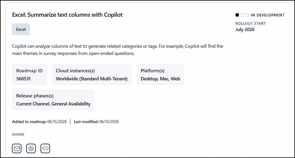
If you have ever stared at a column full of written responses and thought, "I need to group these into themes," this is for you. Think customer survey responses, conference feedback, help desk tickets, or product reviews. Instead of reading every row and tagging it by hand, you hand the column to Copilot and let it do the categorizing.
What you need before you start
You still need a paid Copilot license for this to work — it is built right into Copilot in Excel. If you are not sure which plan you have, here is how to tell whether you have Microsoft 365 Copilot or the free Copilot Chat. I have done text analysis like this before with the COPILOT function, but now it is baked directly into the Copilot pane, so you do not have to write the formula yourself.
The example: a column of survey responses
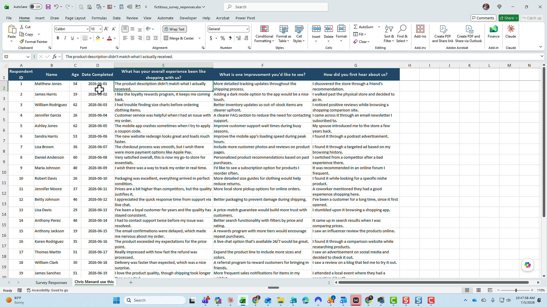
I am working with a spreadsheet of fictitious survey data.
By the way, you can download this file so you can practice with it if you want:
The column I care about is column E, where the header asks, "What has your overall experience been like shopping with us?" Every row underneath is a sentence or two of free text — comments about checkout, the website, customer service, shipping, and so on. There are 25 responses in total, and nothing lives past column G on the sheet, which matters in a moment.
Open Copilot and write one prompt
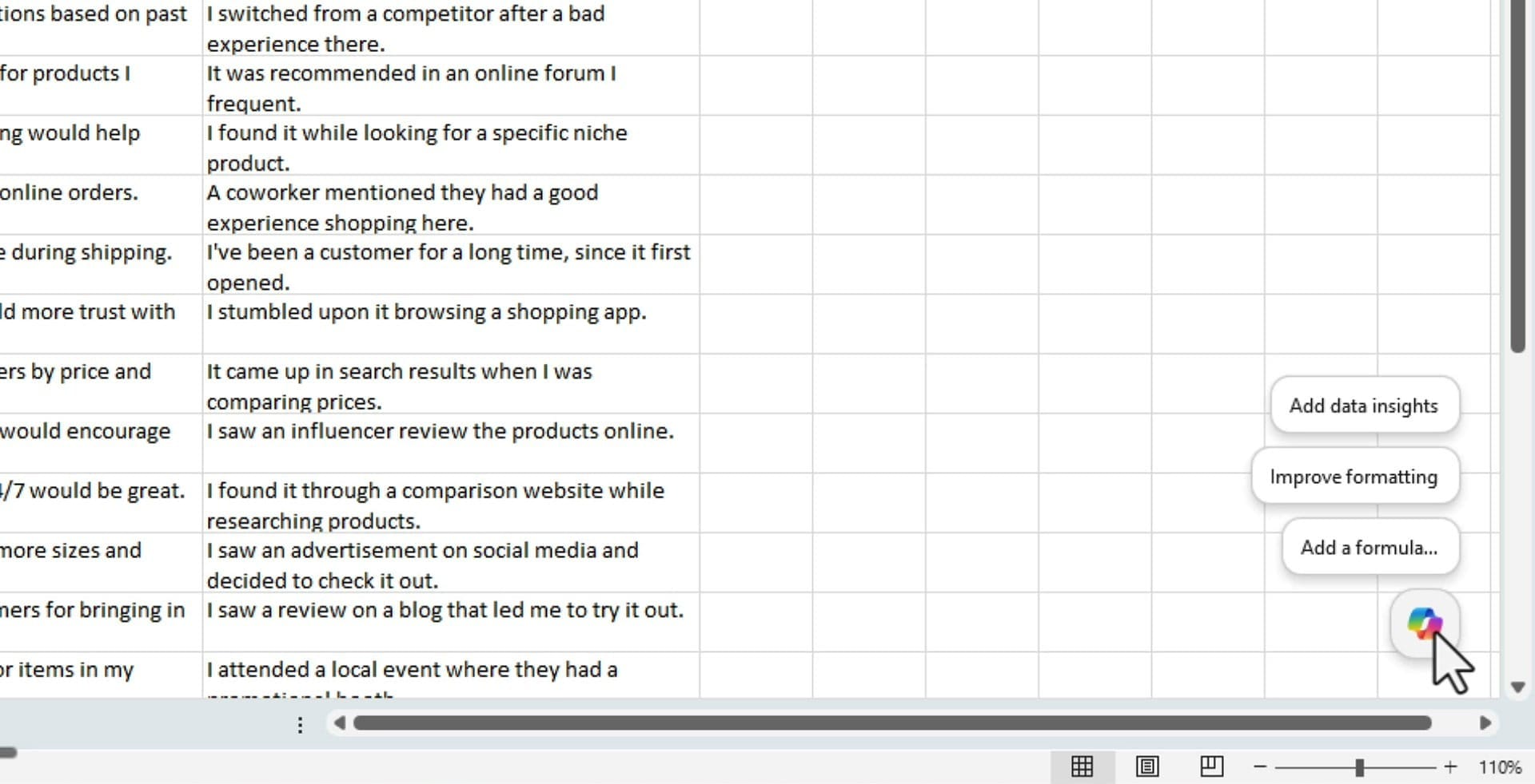
Click the Copilot icon to open the pane and start a new chat. If you hover over the icon you will also see quick options like Add data insights and Improve formatting, but for this we are going to type our own instruction.
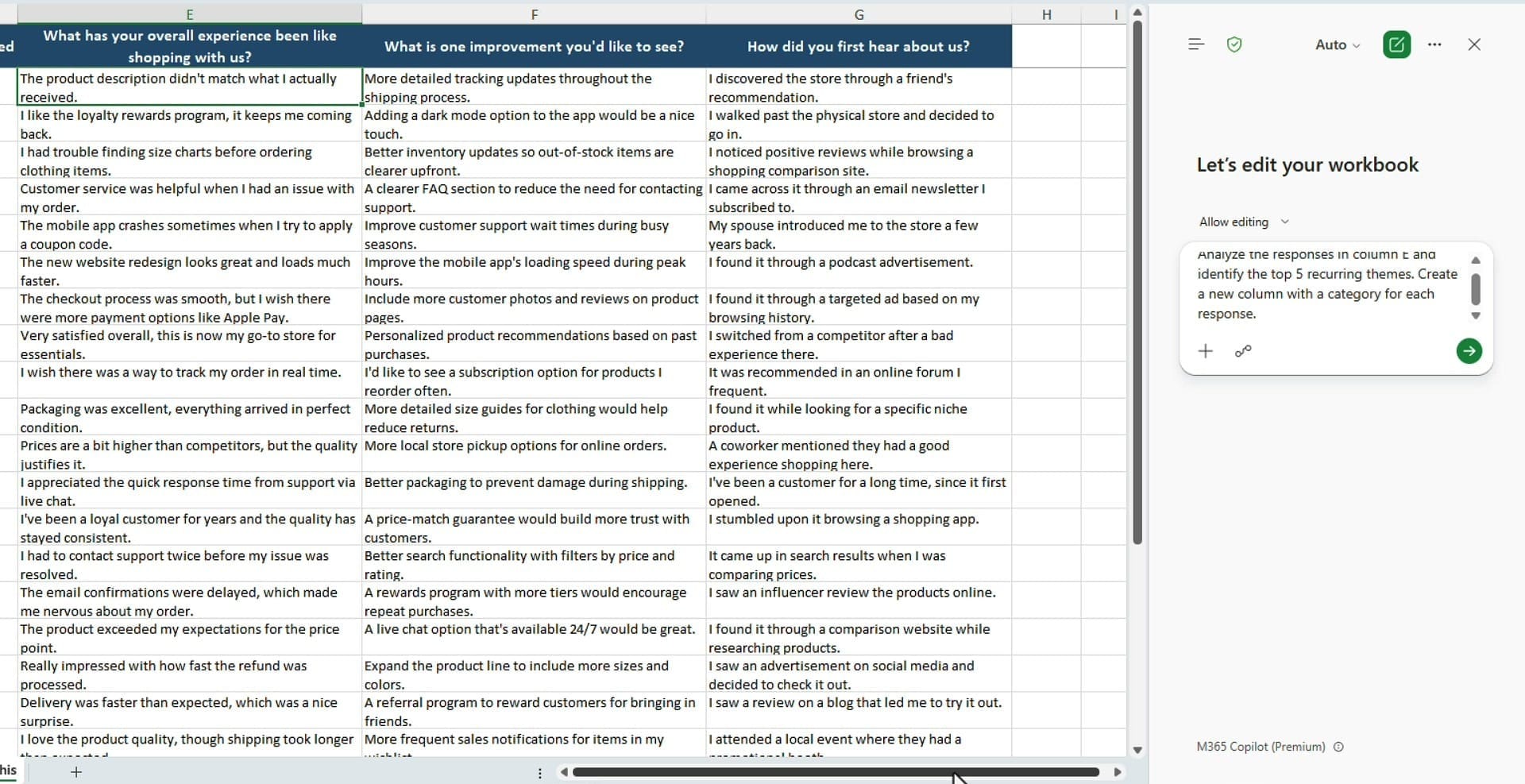
Here is the exact prompt I used:
Analyze the responses in column E and identify the top five recurring themes. Create a new column with a category for each response.
What Copilot builds for you
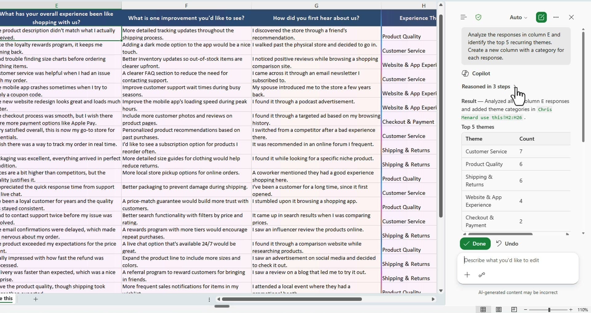
When the pane turns purple, Copilot is working — you can start reading its plan while it finishes. It reasons through the task in a few steps, and you can expand those steps to see exactly what it is doing. The first thing I check is that it looked at all 25 responses, and it did: it confirms the count and works through every row.
From there it does two things. It adds a new "Experience Theme" column (column H) next to the responses and tags each row with a category like Customer Service, Product Quality, Shipping & Returns, Website & App Experience, or Checkout & Payment.
Then it builds a small top-five summary table off to the side, using the COUNTIF function to count how many responses fall into each theme.
Review the results
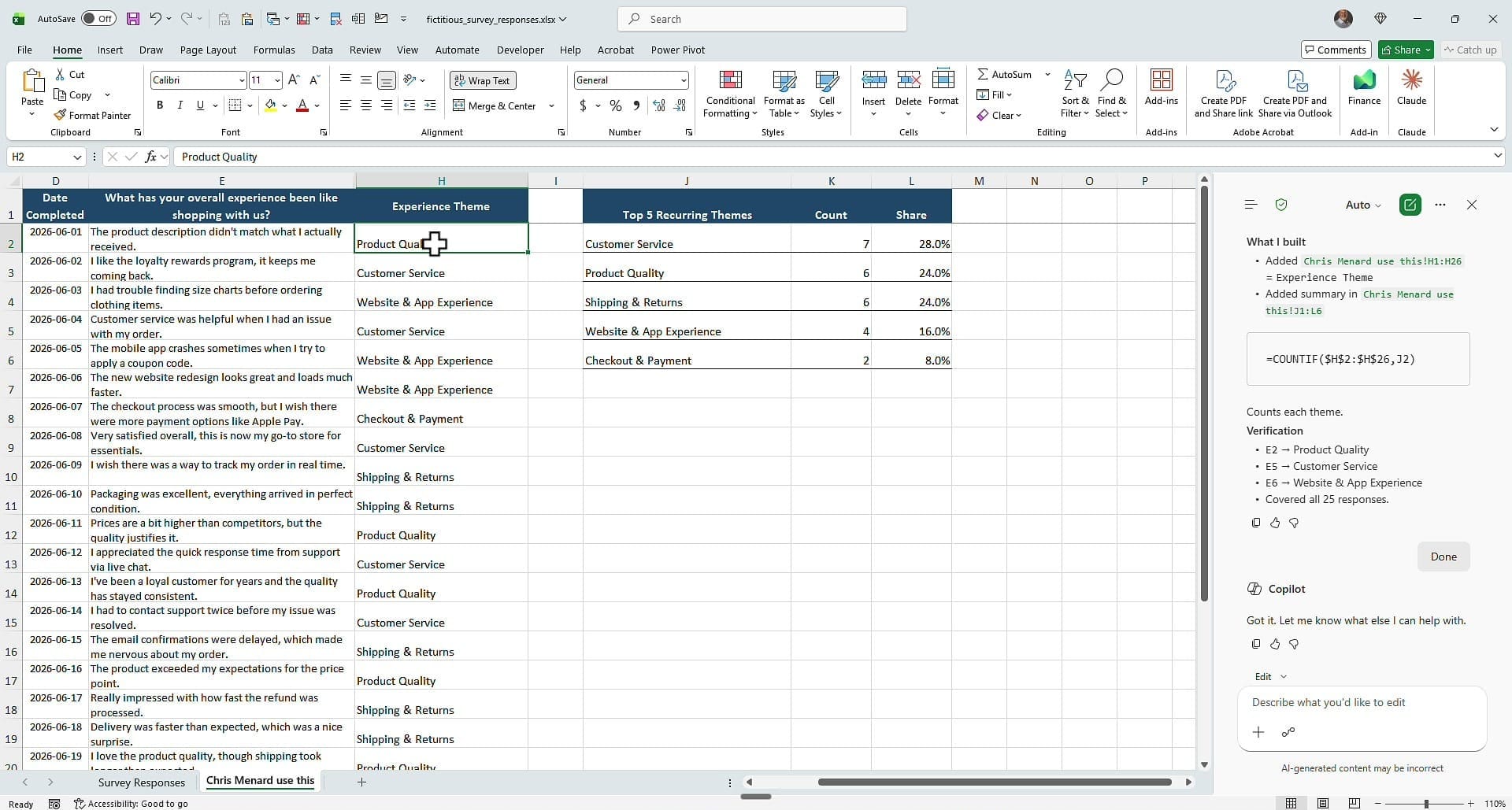
Before you trust any AI output, spot-check it. Walk down the new theme column and sanity-check a few rows against the original text: a comment about a loyalty program reads as Customer Service, a note about the product description maps to Product Quality, and comments about the website and app land in Website & App Experience. The categories held up across the responses I checked.
The summary table gives you the top five themes with a count and a share of the total: Customer Service (7), Product Quality (6), Shipping & Returns (6), Website & App Experience (4), and Checkout & Payment (2). Add up the shares and they come to 100 percent, which is a quick gut-check that nothing was dropped.
Why the summary stays accurate
Here is the part I like most: the counts in the summary table are real COUNTIF formulas, not pasted numbers. Because the formula is live, if the categories ever change — you re-run the analysis, or you edit a theme by hand — the counts and percentages update automatically. You get a genuine, self-maintaining summary of a text column instead of a one-time snapshot.
That is the whole workflow: point Copilot at a text column, ask for themes and categories, and let it tag every row and count the results for you. It turns an hour of manual reading into a single prompt.
Related guides
 Chris Menard
 Chris Menard
 Chris Menard
 Chris Menard