Copilot in Excel: When to Use a PivotTable vs Functions


Copilot in Excel can create PivotTables in seconds, and that is great for basic summaries. But when you need calculations that go beyond what a PivotTable can show — median, second highest, third highest — functions are the better approach. Here is how to use Copilot for both, and when to choose one over the other.
The Source Data
For this example, I have a dataset with car dealership records. The three columns that matter are Brand (column B), Invoice Amount, and Cost. The goal is to summarize these values by car brand.
Option 1: Create a PivotTable with Copilot
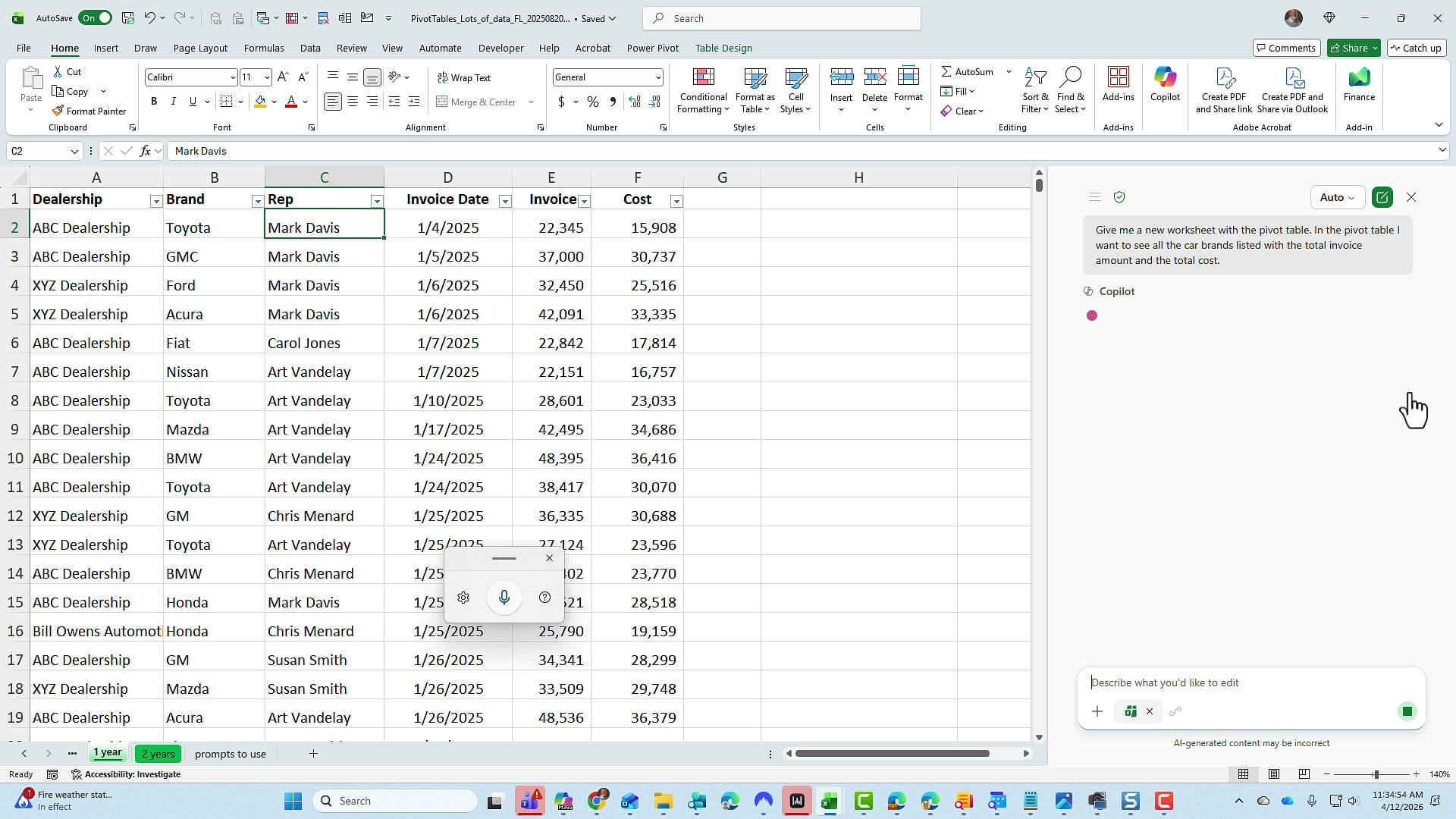
With Edit with Copilot open, I used this prompt:
"Give me a new worksheet with a PivotTable. In the PivotTable, I want to see all the car brands listed with the total invoice amount and the total cost."
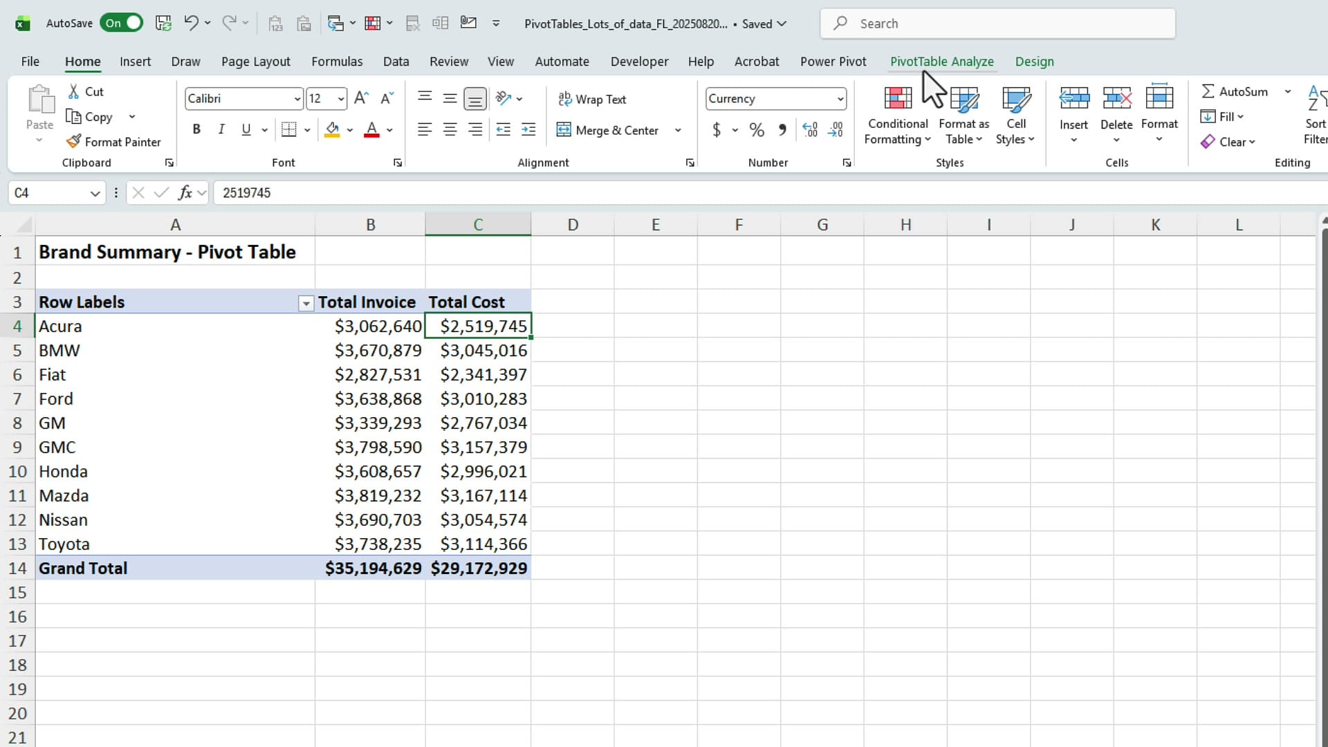
Copilot creates a new worksheet, names it, and builds the PivotTable.
Important: on the confirmation screen, click Done before trying to edit anything. The PivotTable shows each car brand with its total invoice amount and total cost — exactly what was requested.
Where PivotTables Fall Short
That PivotTable works perfectly for totals. But what if you also need the average, the median, the count, the second highest, and the third highest values for each brand? PivotTables can handle some of these (average, count), but median, second highest, and third highest are not standard PivotTable calculations. You would need calculated fields or workarounds, and they get complicated fast.
This is where Excel functions — driven by Copilot — are the better choice.
Option 2: Use Functions Instead
Back on the source data worksheet, I gave Copilot a more detailed prompt:
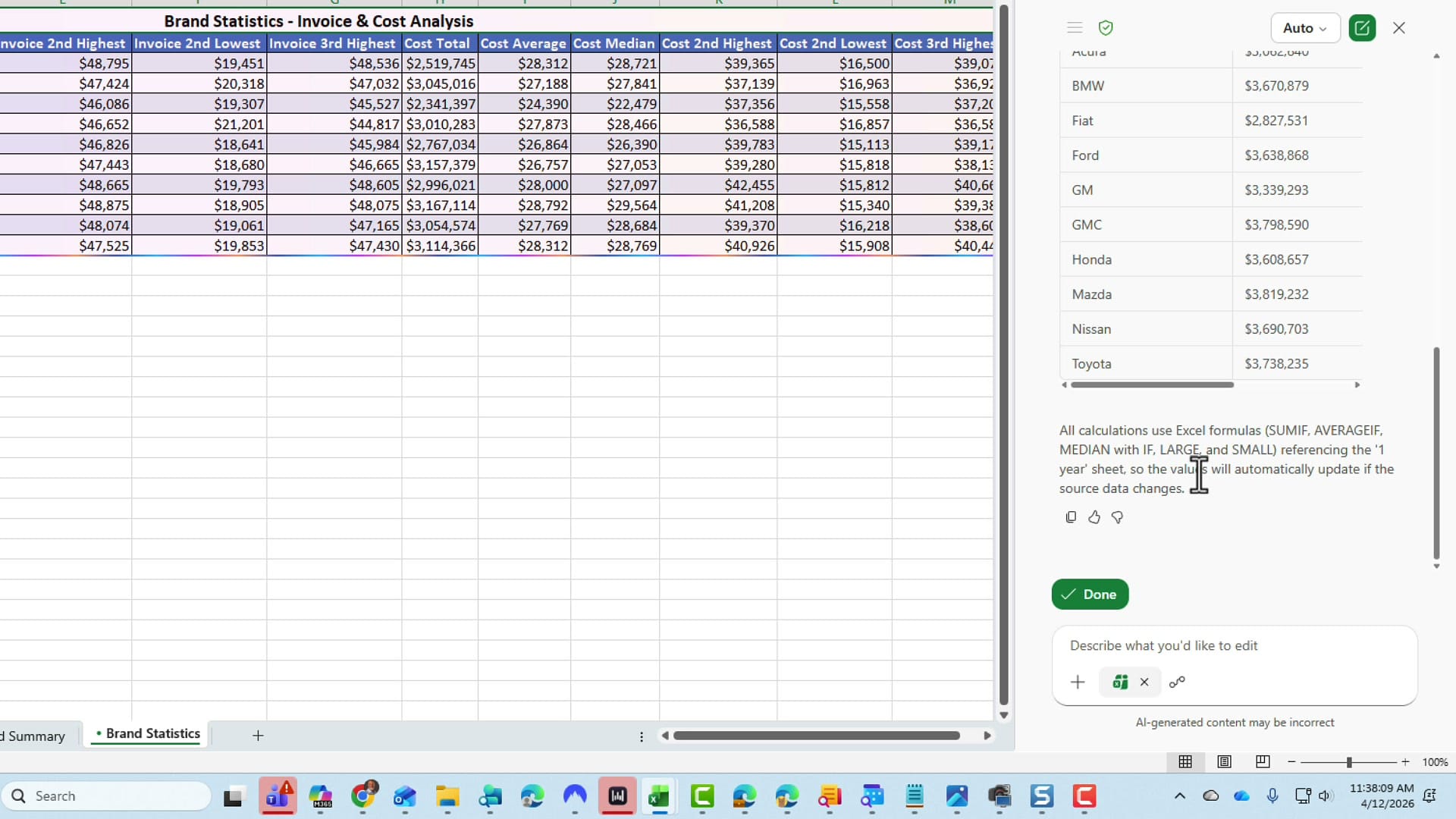
"I would like a new worksheet, and on that worksheet, I want to know for every car brand the following items for both invoice amount and cost: the total, the average, the median, the second highest, the second lowest, and the third highest."
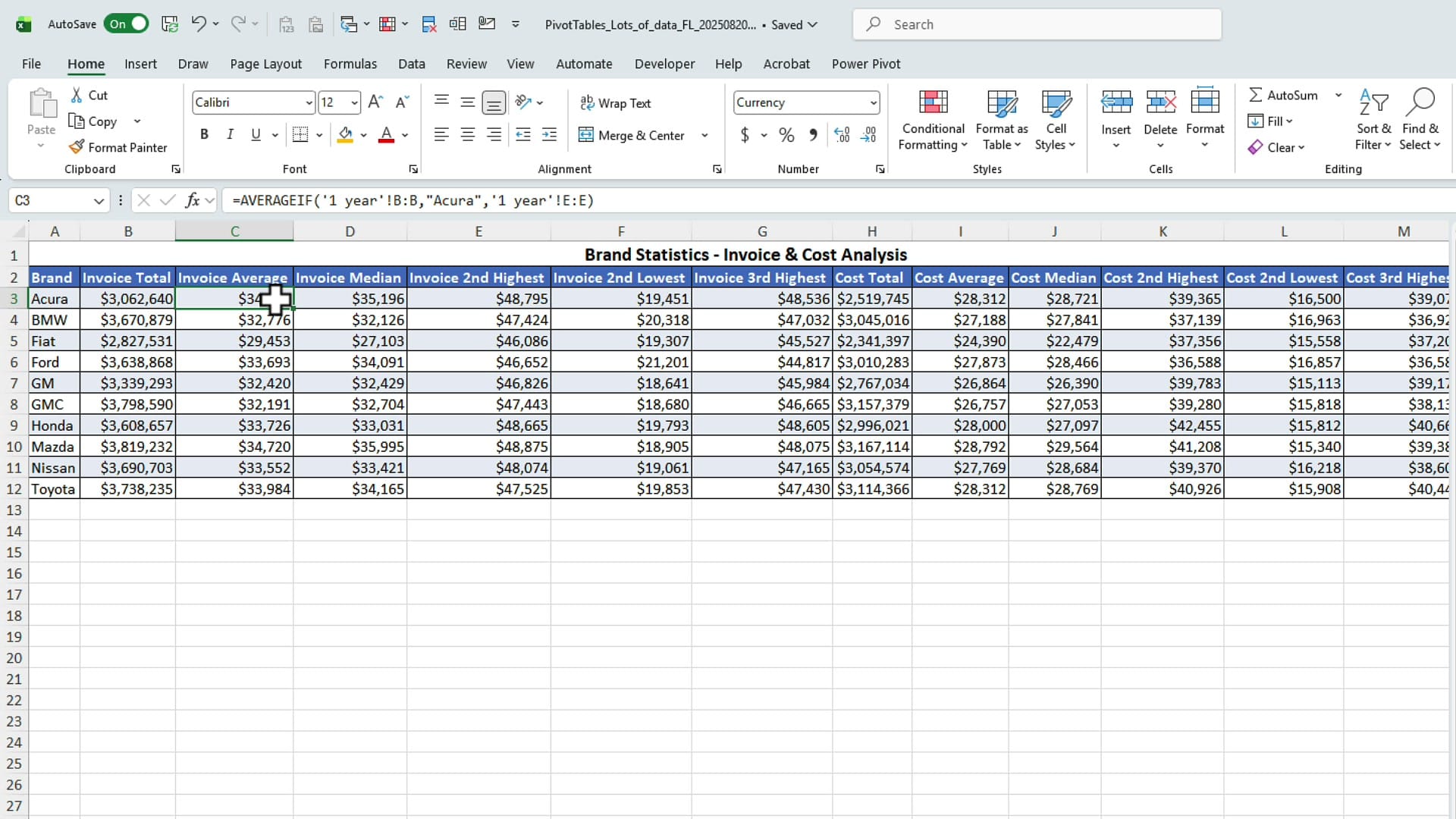
Copilot processed the request, went through its reasoning steps, and created a new worksheet called Brand Statistics with all the requested calculations. It used SUMIF, AVERAGEIF, MEDIAN with IF, LARGE with IF, and SMALL with IF to generate every value.
Inspecting the Formulas
Click on any cell to see the formula Copilot used. The totals use SUMIF, the averages use AVERAGEIF, and the second highest values use LARGE with an IF function to filter by brand. All formulas reference the source data worksheet, so they update automatically if the data changes.
Always Verify the Results
To confirm the numbers, go back to the source data, filter by a specific brand (for example, Acura), and sort by invoice largest to smallest. The second highest value should match what Copilot calculated. In this case, $48,795 matched exactly.

When to Use Each Approach
| PivotTable | Functions | |
|---|---|---|
| Best for | Quick totals, counts, averages | Complex statistics (median, nth highest/lowest) |
| Flexibility | Limited to built-in aggregations | Any calculation Excel supports |
| Updates | Requires refresh | Updates automatically with source data |
| Setup with Copilot | One simple prompt | One detailed prompt |
Both approaches start with a single Copilot prompt. The difference is what you need in the output. For standard summaries, PivotTables are fast and familiar. For anything beyond basic aggregations, let Copilot build the formulas instead.
Related Microsoft Copilot Tutorials


Want to learn more? Visit courses.chrismenardtraining.com for online training courses.