
Create Interactive PowerPoint Slides with Copilot: 3 Practical Examples
The Create interactive slides skill in PowerPoint Copilot turns a table, an Excel workbook, or plain slide content into a clickable slide with filters, live totals, and swapping visuals — and it all works in normal editing view.


PowerPoint just picked up a Copilot skill called Create interactive slides, and it is the one I would pay for a license to get. It takes a table, a spreadsheet, or even a plain content slide and turns it into something a viewer can click — filters, running totals, growth percentages, swapping visuals — all live in normal editing view, without ever starting a slide show.
I am going to walk you through three examples: building an interactive slide from a table already on a slide, building one from an Excel workbook, and making non-numeric slide content interactive. I will also show you how to verify the math before you trust it, and how to update the slide when the numbers change.
What you need
Create interactive slides requires a paid Microsoft 365 Copilot license — not the free Copilot Chat. It is rolling out gradually, so if it is not in your skills list yet, check again in a couple of weeks. The three skills alongside it (Visualize this slide, Review this presentation, and Prepare for questions) have been around a few weeks longer.
Where to find Create interactive slides
Open the Copilot pane in PowerPoint — it opens in the task pane on the right. If your Copilot icon has moved on you, Microsoft has been relocating it; I covered that in my post on the recent Copilot updates in Word, Excel, and PowerPoint.
In the Copilot pane, click the plus sign under the prompt box, then choose Choose skills. Four skills are listed. Pick Create interactive slides and it drops into the prompt box as a hyperlinked skill tag. You then type the rest of your instruction after it.
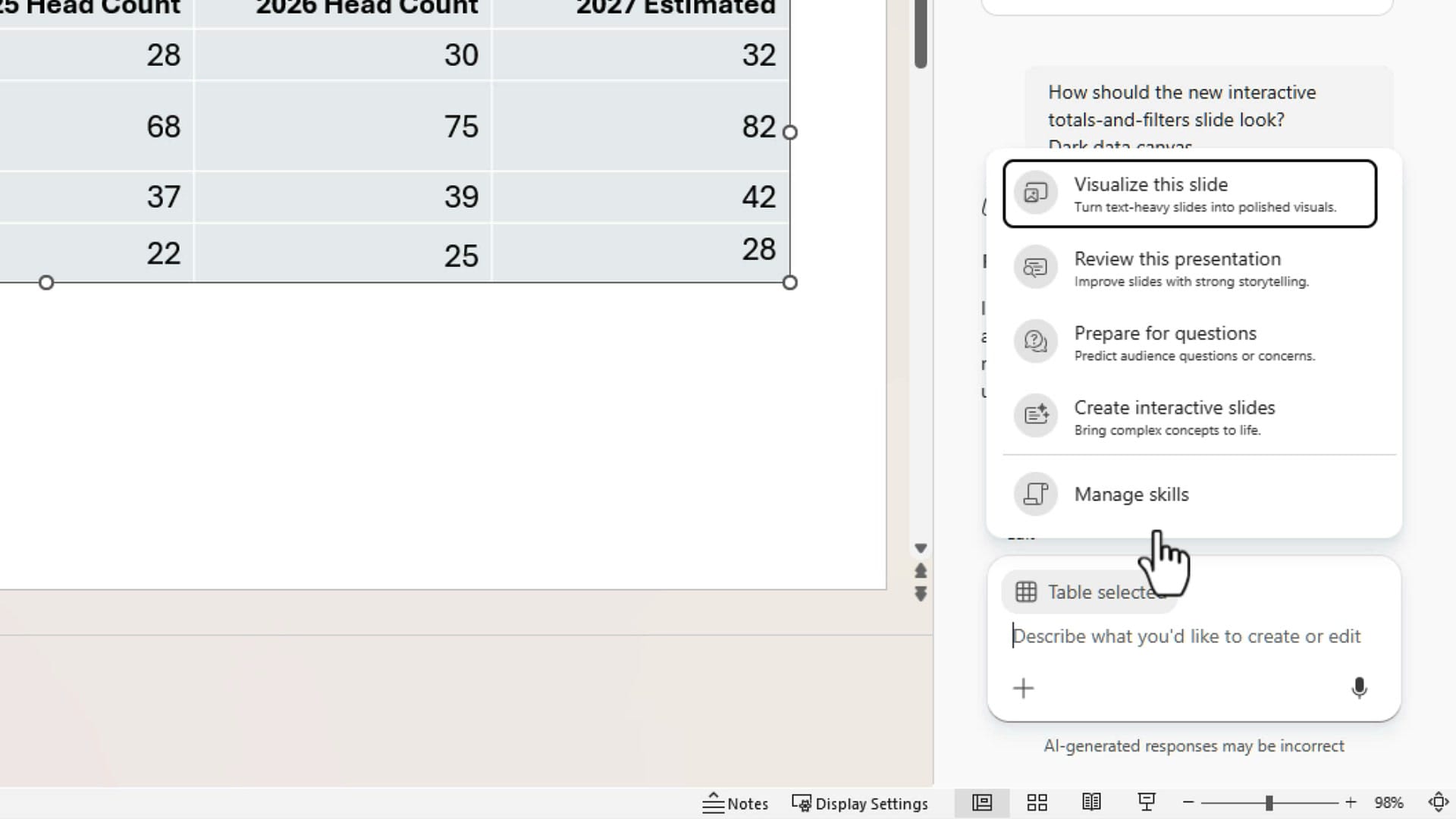
Example 1: Turn a table on a slide into an interactive slide
My starting deck has a slide titled Head Count by Department. It is a plain table: four departments, actual head count for 2024, 2025, and 2026, and a 2027 estimate. Nothing wrong with it — it just sits there.
With slide 2 selected, here is the prompt I used after inserting the skill tag:
create-interactive-slides from the table on slide 2. Leave slide 2 alone as is and make the interactive slide a new slide. I want totals and filters
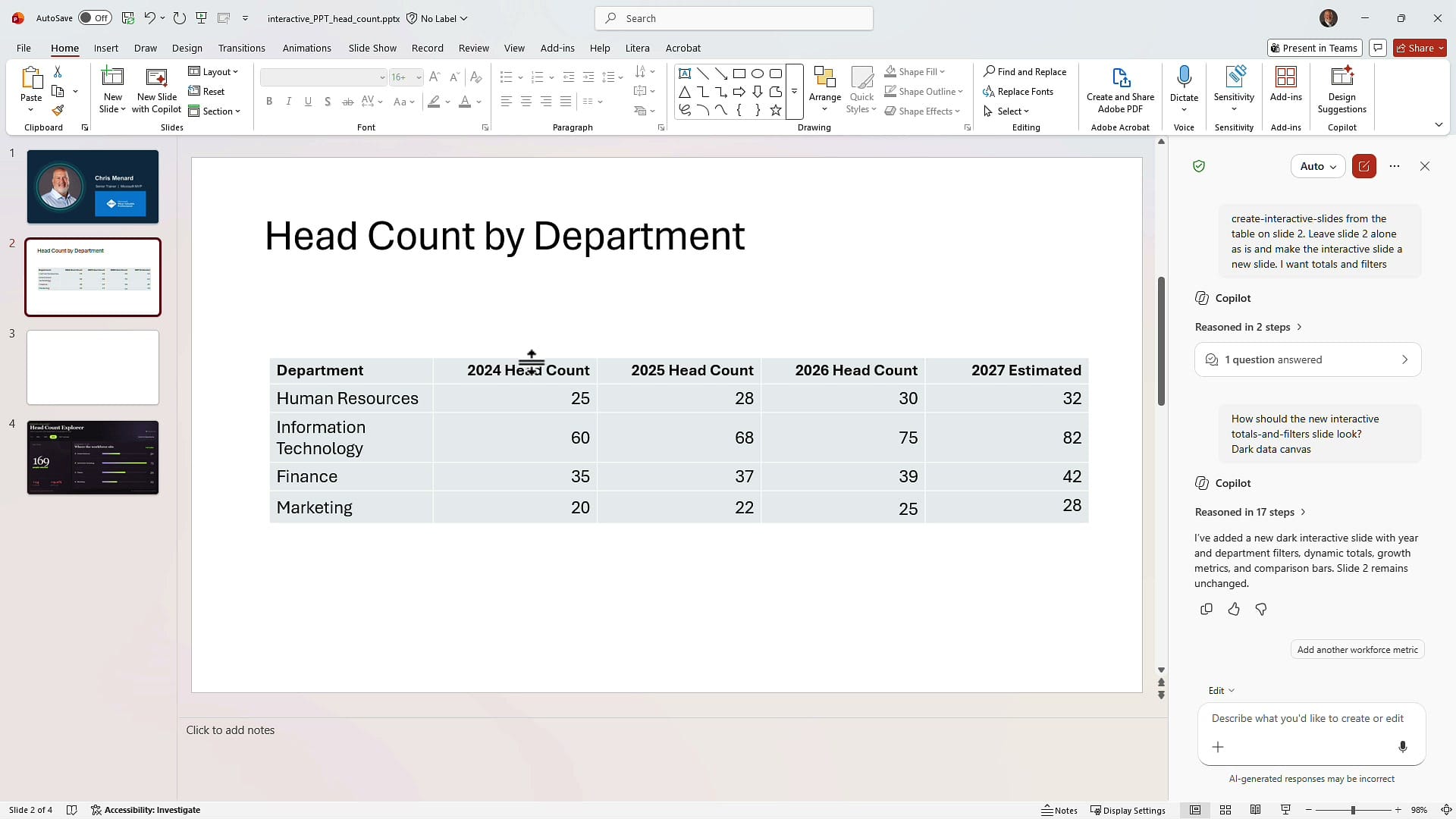
Two things in that prompt matter. First, tell Copilot to build the interactive version on a new slide instead of replacing the table. I want to keep the raw data until I have verified the interactivity. Second, say what you want out of it — in my case, totals and filters.
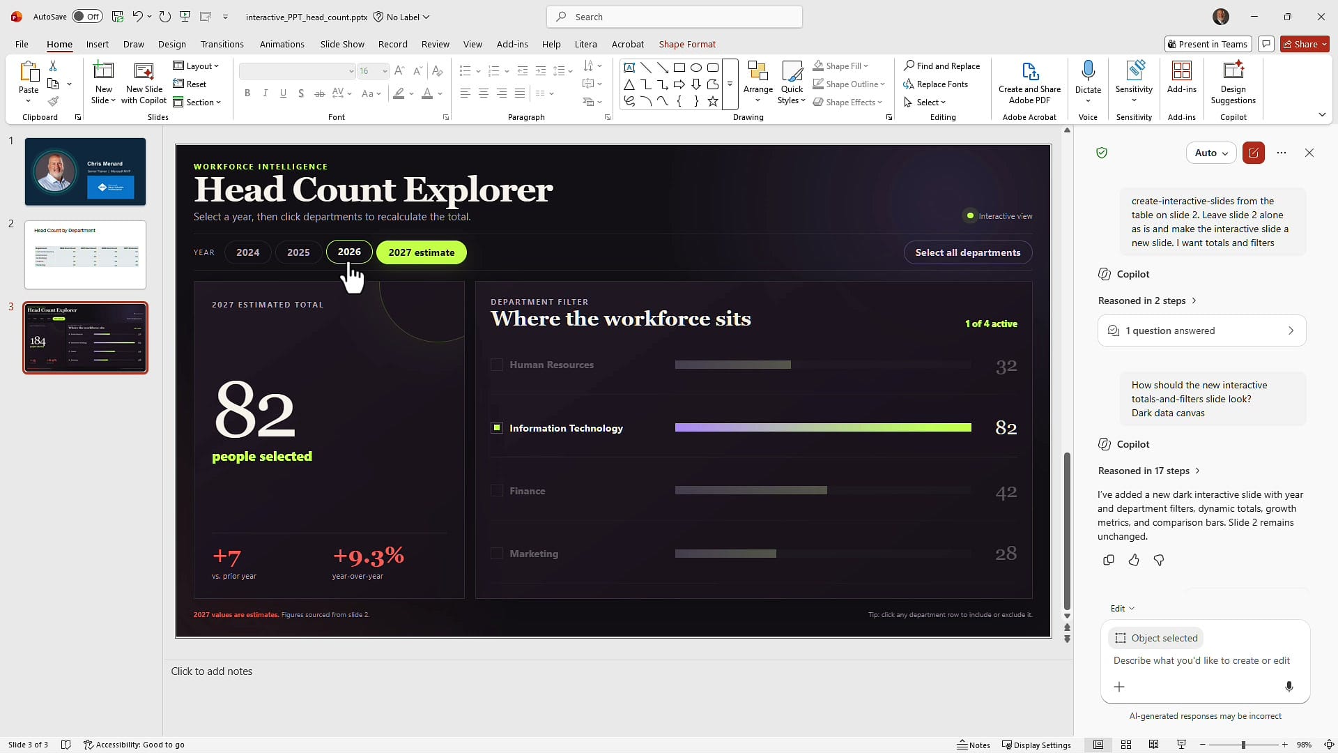
Copilot came back with a new slide called Head Count Explorer. Across the top are year buttons — 2024, 2025, 2026, 2027 estimate — plus a Select all departments button. On the left is a big running total, and on the right is a department filter where each row can be switched on or off.
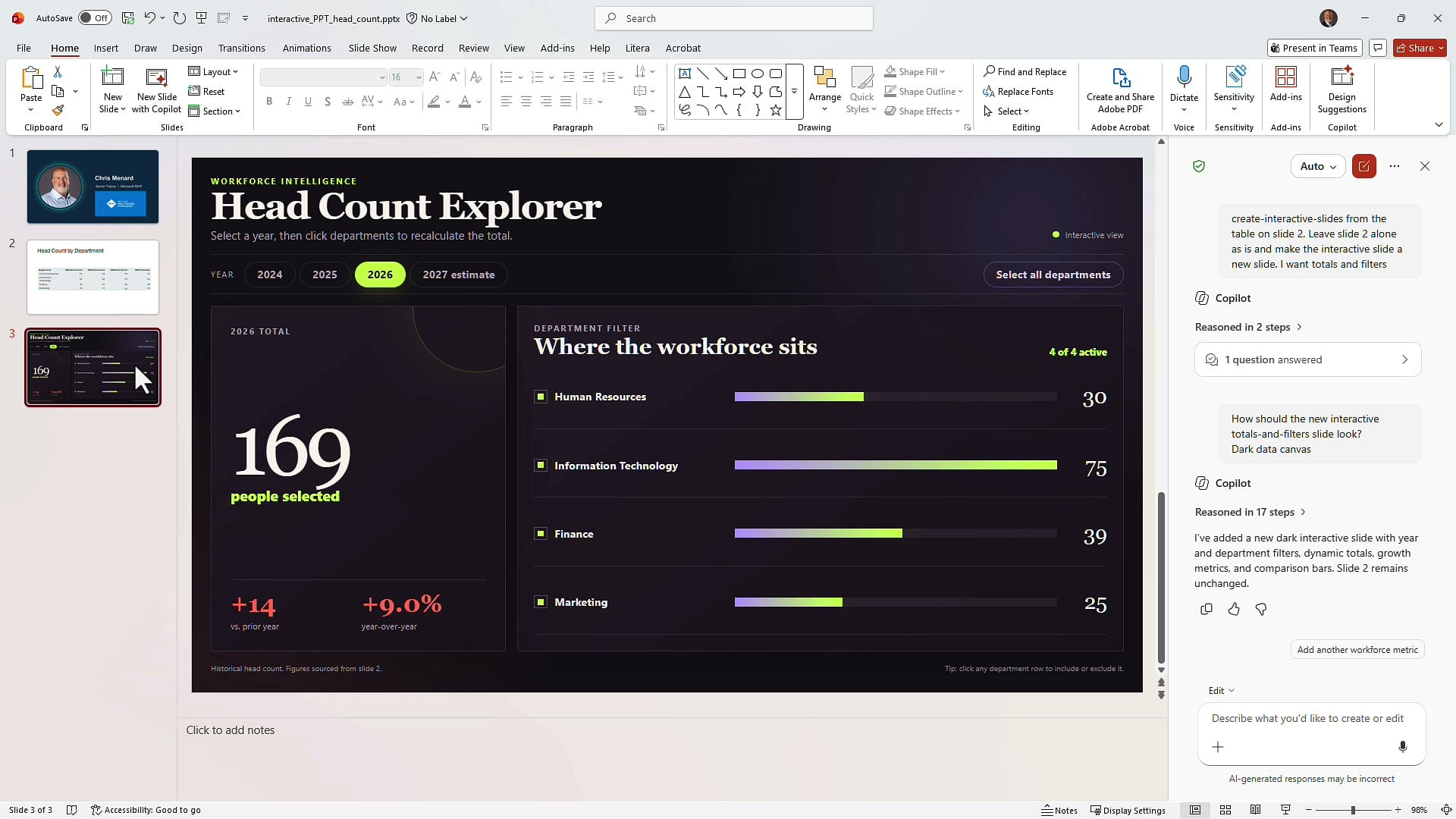
The best part: this works in normal editing view. I am not in slide show mode in any of these screenshots. Click a year, click a department, and the numbers recalculate right there on the canvas.
Verify the math before you trust it
This is the step people skip. Before you rely on a generated slide in front of an audience, check a few numbers against your source.
Click 2027 estimate and the total jumps to 184, with a +15 change and an 8.9% year-over-year increase.
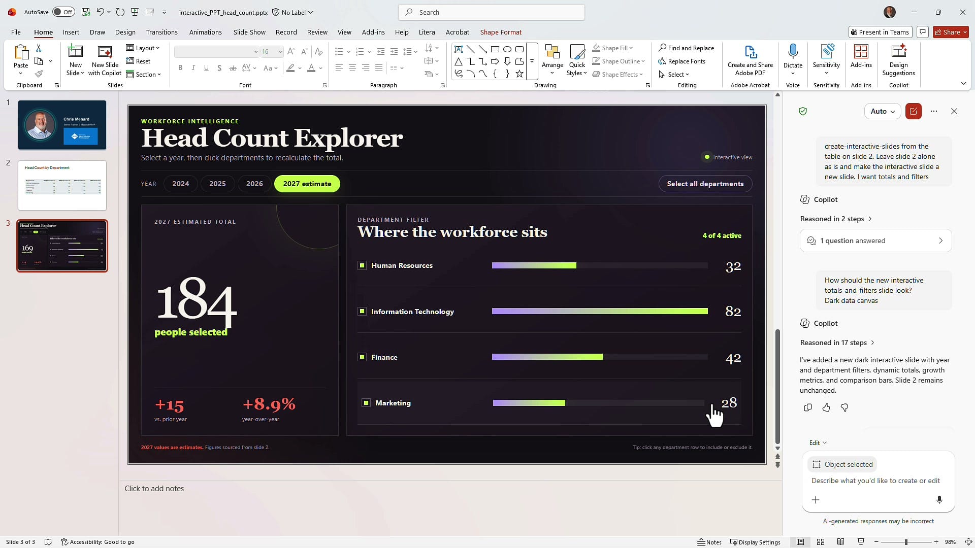
I copied the table into Excel, ran an AutoSum, and calculated the percentage change: 169 to 184 is 15 more people, an 8.9% increase. That matches. Do the same with a single department. Turn everything off except Information Technology and click through the years — 60, 68, 75, 82 — and watch the total in the bottom left update as you go.
Once the spot checks line up, you can either hide slide 2 or delete it. That is up to you — but keep it until you have tested.
Updating an interactive slide when the data changes
Here is the important caveat before you build a deck around this: editing the source table does not automatically update the interactive slide. There is no live link between them.
You have two ways to handle it.
If you kept the source slide: change the numbers in the table, then tell Copilot in the prompt box something like "I've updated the table on slide 2 — go update the interactive slide on slide 3." That works.
If you already deleted the source slide: go to the interactive slide and change the value straight from the prompt box. Here is the prompt I used:
for IT for 2027 estimate, we now are expecting 86. Change slide 3
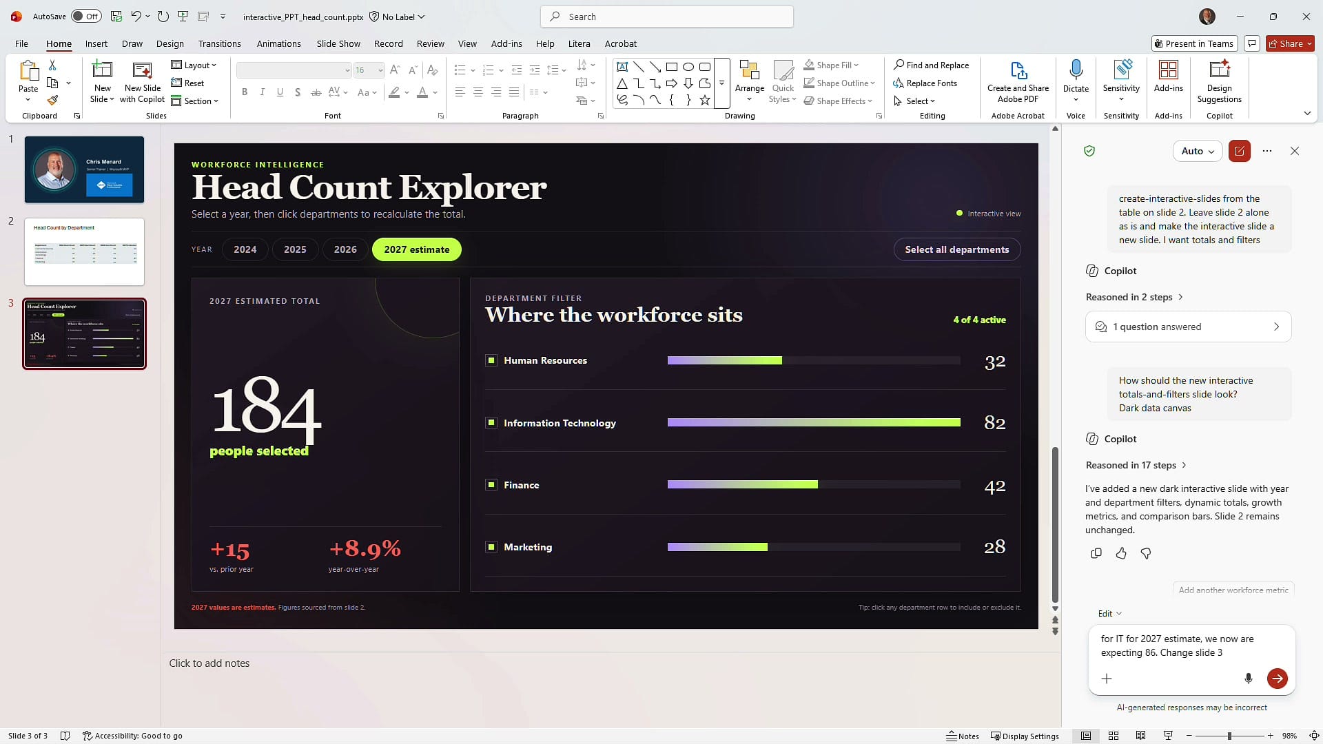
Copilot rewrote the slide and the numbers recalculated: IT moves to 86, the total goes from 184 to 188, and the growth metrics update to +19 and 11.2%. I checked that in Excel too — it is correct.
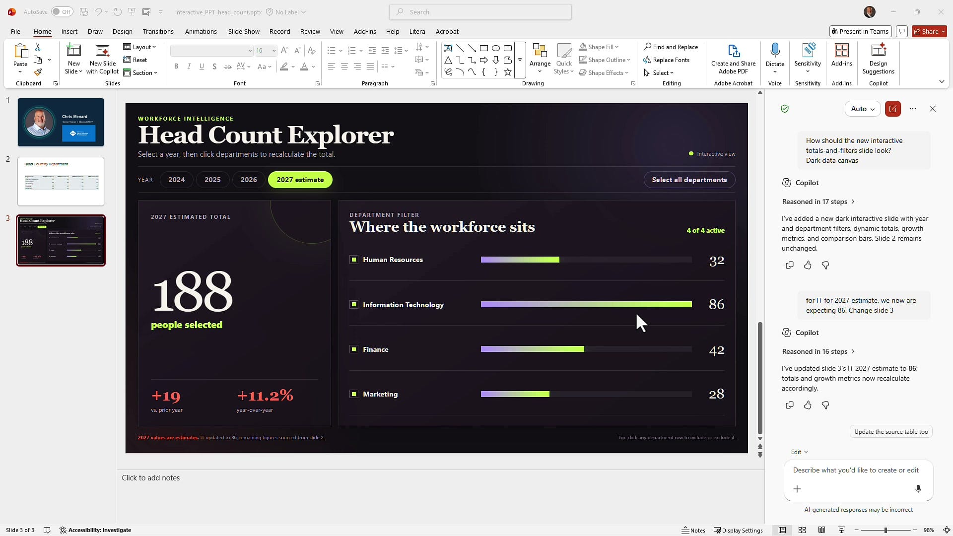
Note the follow-up chip Copilot offers: Update the source table too. If you kept slide 2, that one click keeps both slides in sync.
Example 2: Build an interactive slide from an Excel file
The second example starts outside PowerPoint. I have a workbook with car brands in column A, the year in column B, and revenue and profit in columns C and D — one row per brand per year across six years.
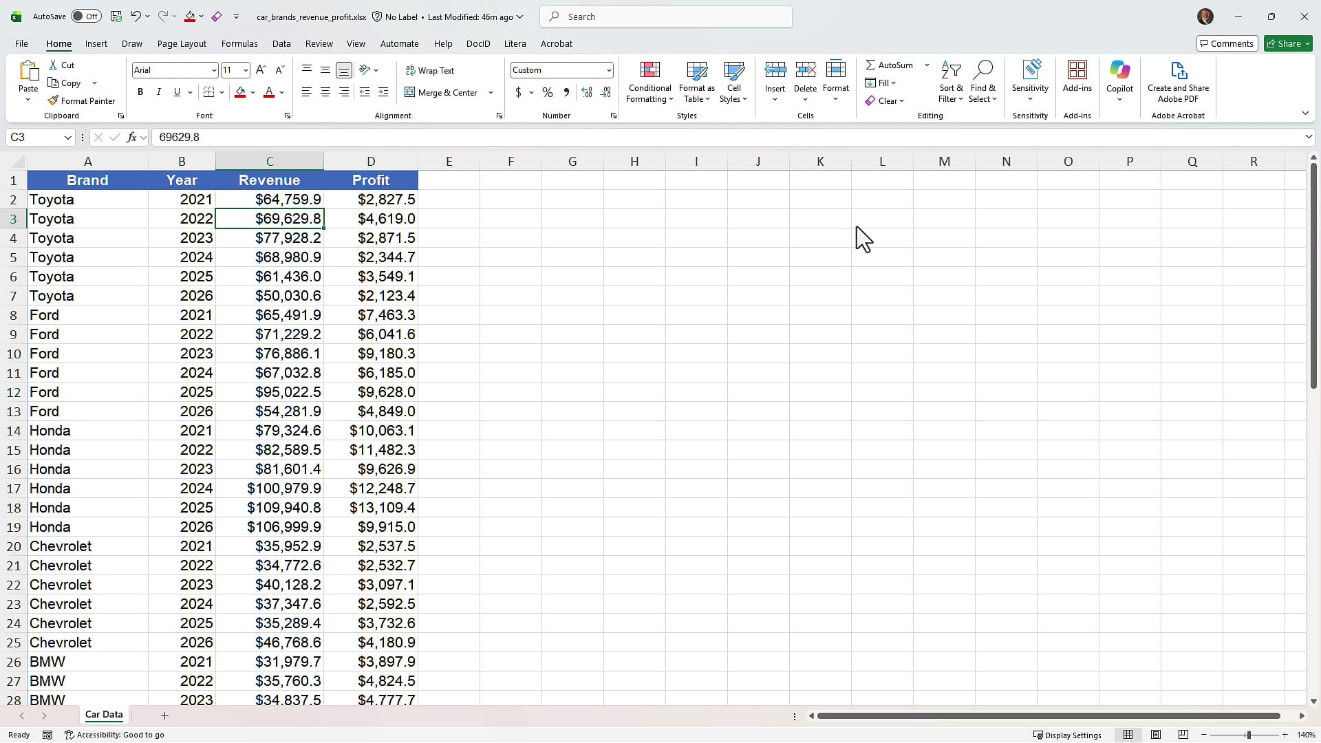
In the Copilot pane in PowerPoint, upload the Excel file — you can pull it from your Downloads folder or from OneDrive — then select Create interactive slides and describe what you want. Ask for a year filter, revenue and profit totals, and a brand comparison. (If you would rather have Copilot generate a whole deck from a workbook instead of a single interactive slide, I covered that in creating PowerPoint presentations from Excel files.)
What came back is a slide called Revenue scale, profit signal. It opens on "All years" with total revenue of 3.44M, total profit of 360K, a peak year callout, and a combined column-and-line chart of annual totals — revenue as columns, profit as the line.
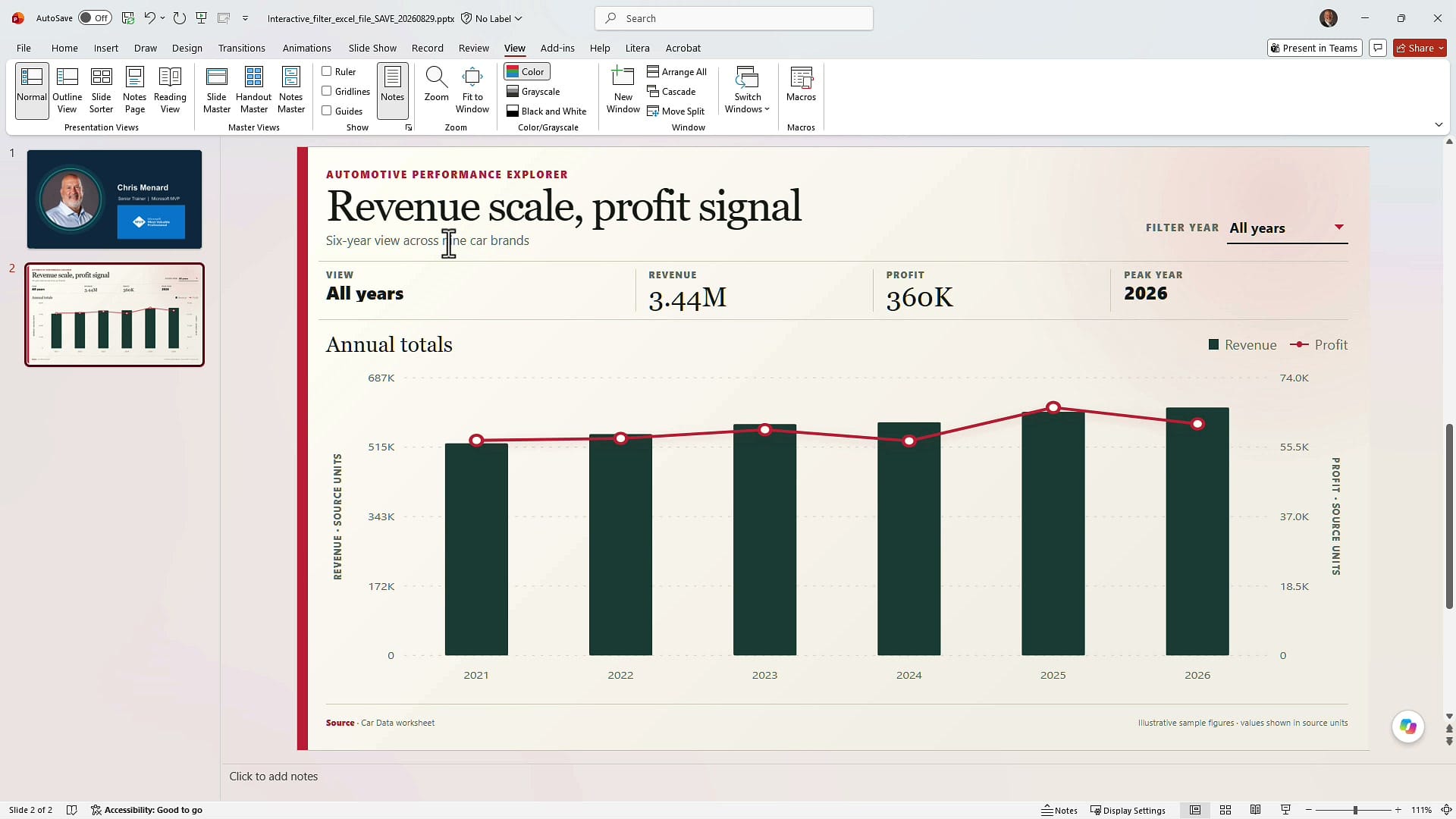
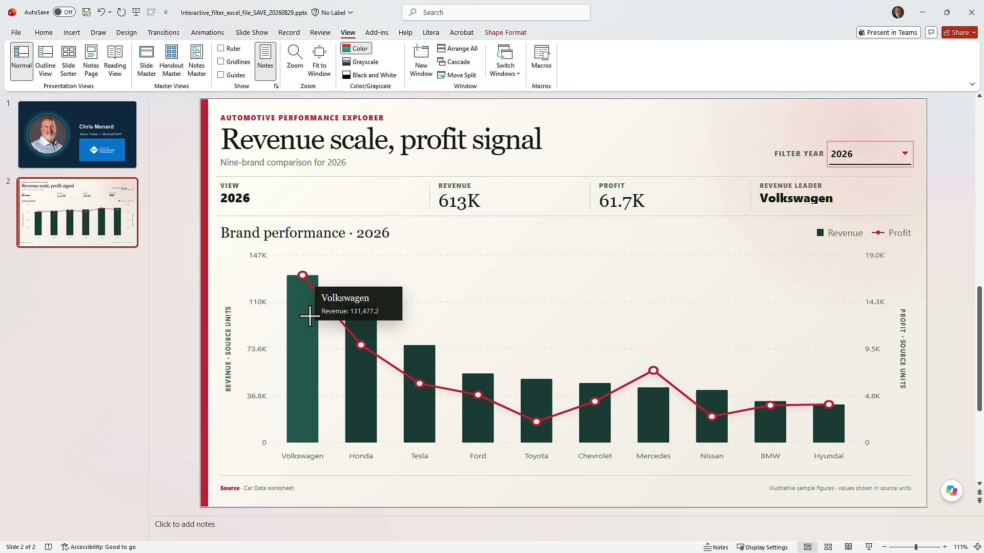
Now use the Filter year dropdown in the top right. Pick a single year and the whole slide re-renders: the headline changes to a nine-brand comparison for that year, the totals recalculate, and a revenue leader appears. Hover any column and you get the exact figure.
Example 3: Make non-numeric slide content interactive
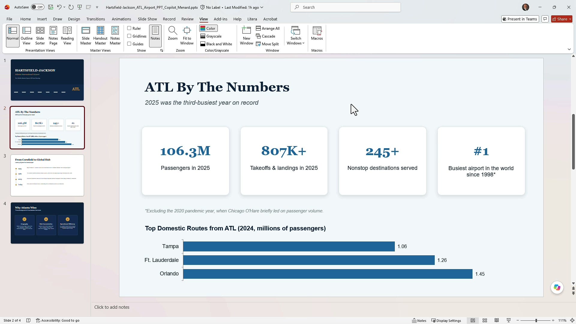
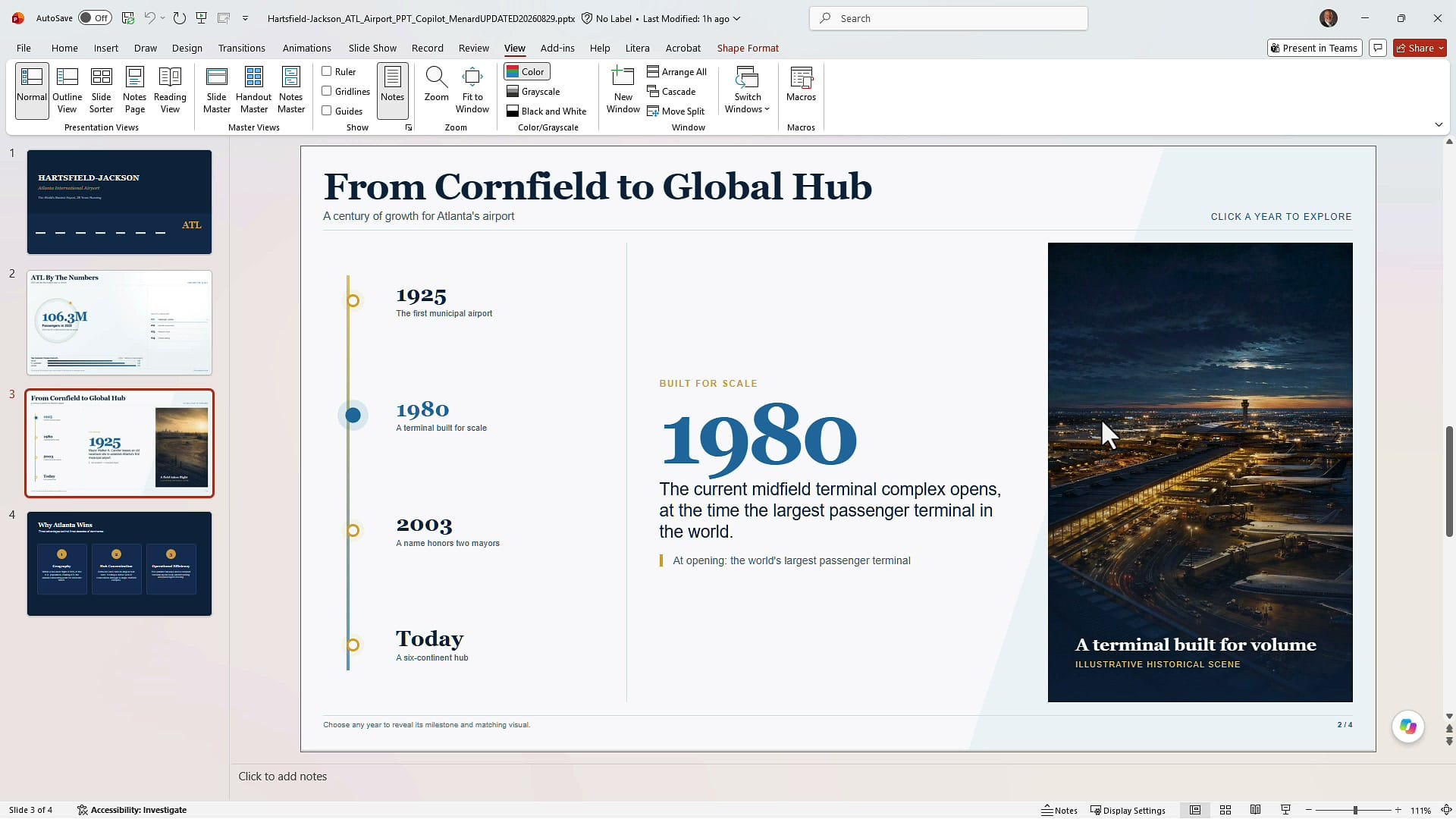
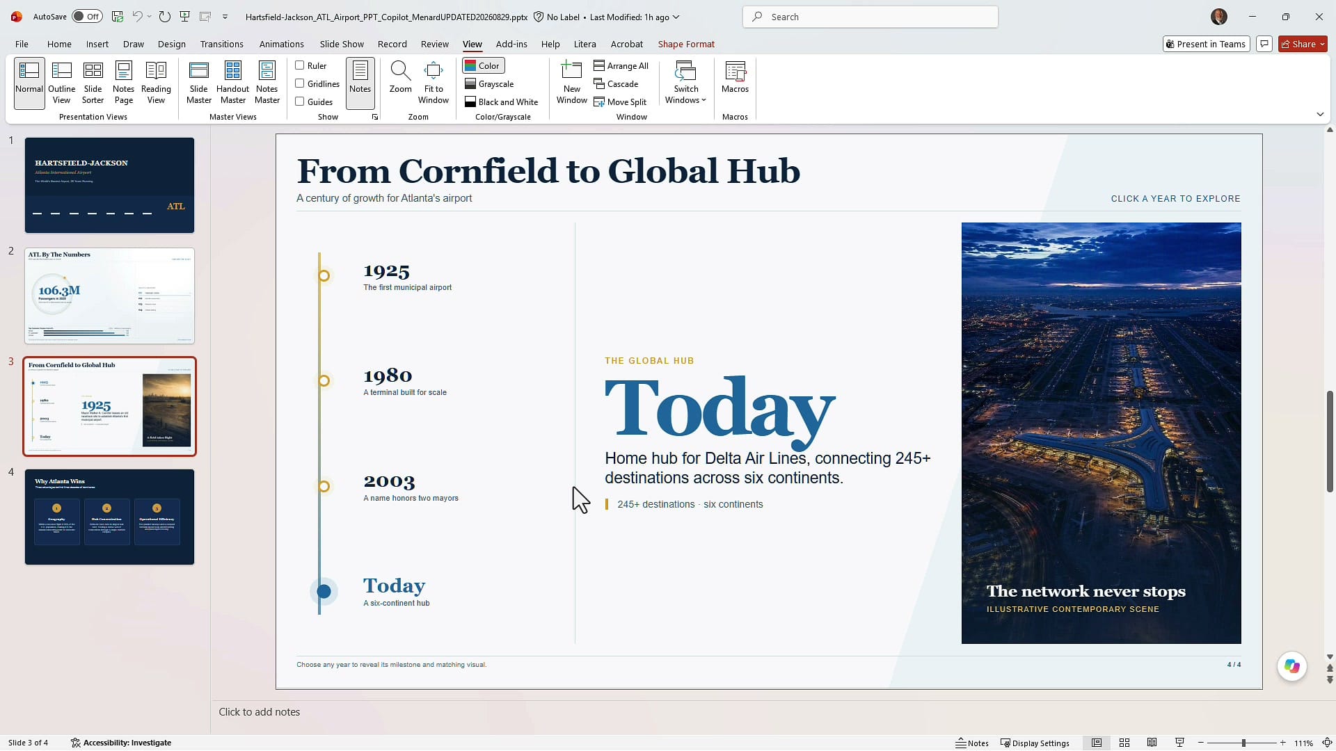
Filters and totals are the obvious use, but the skill is not limited to numbers. My third deck is about Hartsfield-Jackson Atlanta International Airport. Slide 2 is a stat slide — four cards with passenger counts, takeoffs and landings, destinations served, and a world ranking, plus a bar chart of top domestic routes. Slide 3 is a timeline: 1925, 1980, 2003, Today.
I selected Copilot, clicked Create interactive slides, and typed one sentence: change slides 2 and 3 and make them both interactive. That was the whole prompt.
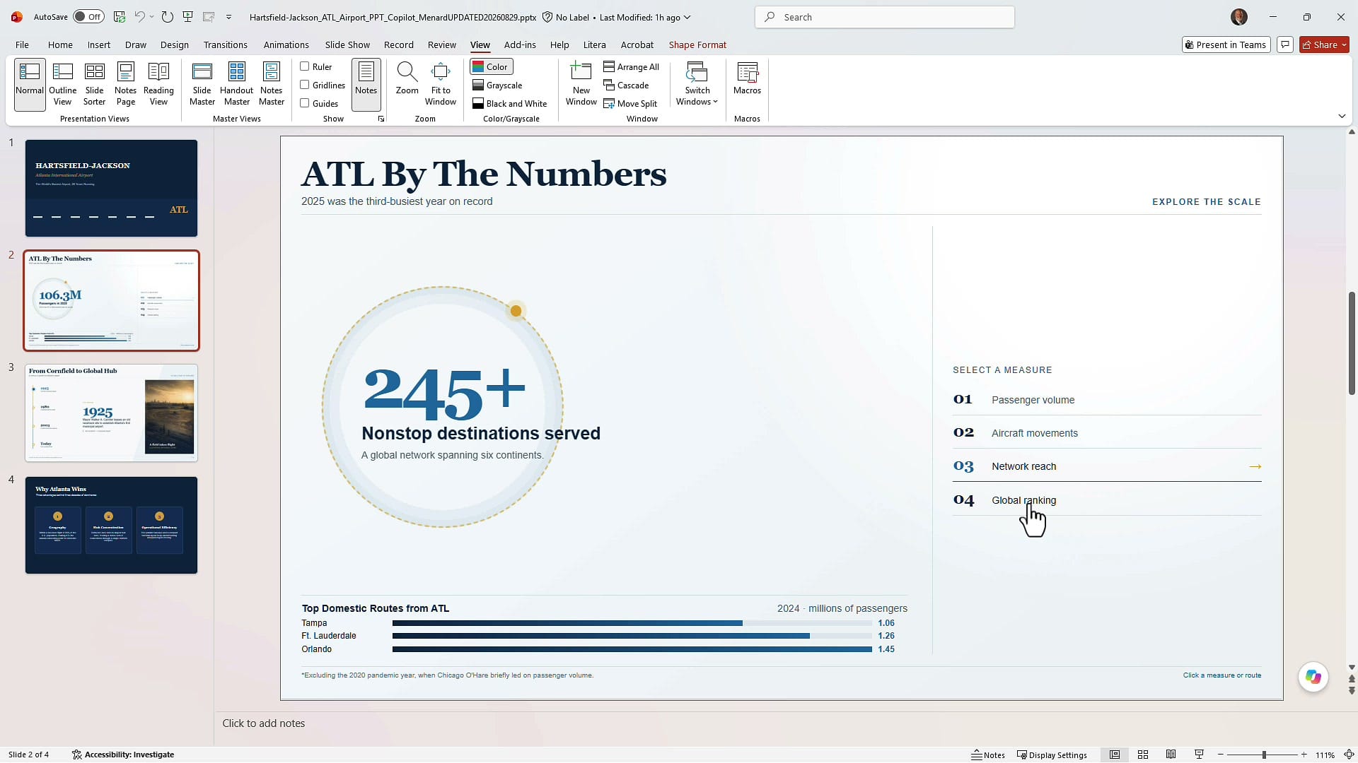
Slide 2 came back as a Select a measure layout. Four measures are listed down the right — passenger volume, aircraft movements, network reach, global ranking — and clicking one drops that figure into a large circle in the center with its own supporting sentence. One number at a time, in the order you choose to tell the story.
Slide 3 became a clickable timeline. Select a year on the left and the headline, the paragraph, and the pull quote all change. The first pass kept one static runway photo on the right no matter which year I picked, so I went back to Copilot and asked whether each year could have its own image. It did it.
Refining the layout after Copilot builds it
The output is not always pixel perfect, and you fix it the same way you built it — with a prompt. On my stat slide, the larger figures run past the edge of the circle they sit in.
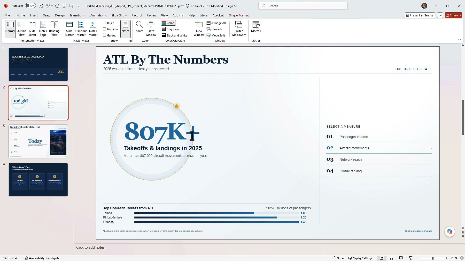
Rather than nudging shapes by hand, go back to the prompt box and ask for the change: keep slide 2 interactive, but replace the circle with a rectangle so the text fits inside it. Treat layout cleanup as another round of prompting, not manual formatting.
Tips worth remembering
- Build on a new slide. Tell Copilot to leave your source data alone so you can verify against it.
- Spot check the math. Copy the table into Excel, AutoSum it, and check a couple of totals and percentages before you present.
- Hide or delete the source slide once you are satisfied — do not delete it first.
- There is no live link. Changing the source table does not update the interactive slide. Prompt Copilot to update it, or use the "Update the source table too" follow-up to sync in the other direction.
- Clean source data wins. One row per record, clear headers, no merged cells.
- Fix layout with prompts, not by dragging shapes around.
- It works in normal view. You do not need to run the slide show to click through the interactivity.
Microsoft got this one right. If you have a paid Copilot license and you build data-heavy decks, this is the skill to try first.
Related guides