Creating a Column Chart using S&P 500 data with Positive and Negative Colors in Excel
Posted on: 04/25/2024
Introduction
When working with Excel, presenting numerical data effectively is key to clear communication. Imagine a scenario where you're analyzing the S&P 500 index's performance over several years. You'll likely encounter both positive and negative percentage changes. Distinguishing between these with just numbers can be dry and difficult to immediately grasp. That's where a column chart with positive and negative colors comes into play. By applying different colors to positive and negative values, we transform a simple chart into a vivid, instantly understandable visual. This approach not only makes the data more accessible but also more compelling to your audience. Let's explore how to bring this concept to life in Excel, enhancing our data visualization skills.
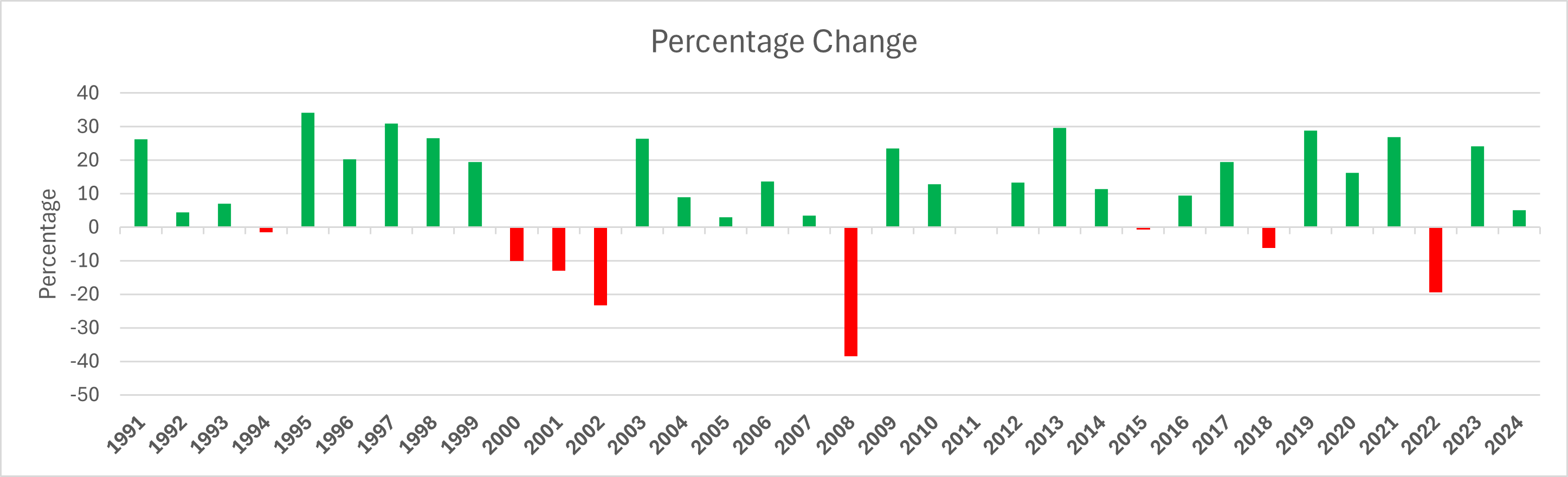
S&P 500 chart with percentage changes
Video - S&P 500 data in a column chart with different colors
Using Conditional Formatting in Excel
Conditional formatting in Excel is a powerful tool that can transform the way you visualize data. It automatically applies formatting changes like colors, icons, or data bars to cells based on specific conditions. This means you can highlight important data points, identify trends at a glance, and make your spreadsheets more readable and visually appealing. Let's dive into how to use conditional formatting effectively.
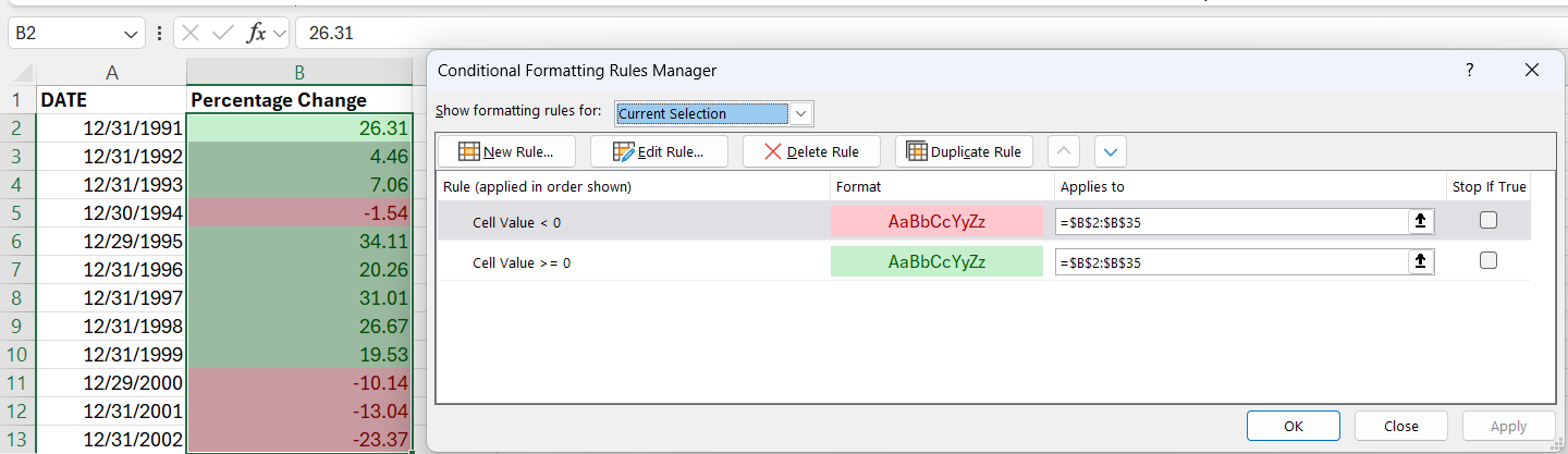
Excel Conditional Formatting with Percentages
Steps to Apply Conditional Formatting
-
Select your data range: Start by selecting the cells you want to format. You can do this by clicking on a cell and dragging your mouse to select multiple cells.
-
Access the Conditional Formatting menu: Navigate to the 'Home' tab on the ribbon. Here, you will find the 'Conditional Formatting' button. Click it to see the various options available.
-
Choose a formatting rule: Excel provides a range of predefined rules for common tasks like highlighting cells that are greater than a certain value, duplicating values, and more. You can also create your own custom rules for more specific needs.
-
Customize your rule: After selecting a rule, you'll be prompted to specify the criteria. For example, if you're highlighting cells greater than a certain value, you'll enter that value. You'll also choose the format (such as text color, cell fill color, etc.) to apply when the condition is met.
-
Apply and review: Once you're happy with the rule, apply it. Your selected range will immediately reflect the changes based on the conditions you set. If needed, you can go back and adjust or remove conditional formatting rules.
Conditional formatting is not just about making your data look good; it's a practical tool for data analysis and presentation. For instance, applying different colors to positive and negative numbers can instantly convey performance without needing to study the actual figures. The key to effective conditional formatting is to use it sparingly and thoughtfully, ensuring that it enhances rather than complicates your data's story.
Creating and Formatting the Column Chart
Creating a column chart in Excel that differentiates between positive and negative values can significantly enhance our ability to quickly interpret data. This becomes especially useful when dealing with a dataset that spans many years, such as the S&P 500 index's performance. Let's walk through the process of creating and formatting this type of chart.
Setting Up the Chart
First, I select the dataset I'm interested in visualizing. In our case, it's the yearly performance of the S&P500 index. With my data selected, I navigate to the 'Insert' tab and choose 'Column Chart' from the options. Excel might suggest several chart types, but a simple column chart is what we need for this task.
Adjusting the Appearance
Initially, the chart might not look exactly how we want it to. The columns representing our data could be too thin, making them hard to see. Additionally, the default date formatting could clutter the chart, displaying unnecessary details like the month and day.
- To address the column width, I adjust the chart's axis options, changing it to a 'Text Axis'. This spreads the columns out for better visibility.
- For the date formatting, I format the axis labels to display only the year, simplifying our chart and making it easier to read.
Applying Colors to Differentiate Data
The most crucial step in our chart creation is applying different colors to the positive and negative values. This is where our chart truly begins to communicate the data effectively. By selecting the columns in the chart, I access the 'Format Data Series' pane.
- I check the 'Invert if negative' box, which allows me to assign different colors to positive and negative values.
- For positive numbers, I choose a green fill color, symbolizing growth or positive performance.
- Negative numbers get a red fill color, indicating a decrease or loss.
After applying these colors, the chart instantly becomes more informative and visually appealing. Positive and negative years are now easily distinguishable at a glance, making our chart not only a tool for data presentation but also a means of quick data analysis.
Recent Articles

Nov 4, 2025 - Executive Insights: Harnessing Excel for Strategic Analysis
Nov 4, 2025 - Join us on November 4, 2025, for a live, in-person training: Executive Insights – Harnessing Excel for Strategic Analysis. Learn how to master Power Query, PivotTables, data cleaning, sorting and filtering, conditional formatting, and charts to create impactful reports and support leadership with confidence. Perfect for Executive Administrative Professionals looking to boost efficiency and deliver data-driven insights.

Summarize Outlook Attachments with Copilot
In today’s fast-paced digital world, managing emails efficiently is crucial, especially when it comes to handling attachments. I demonstrate an exciting new feature that has rolled out in Microsoft Outlook’s Copilot — the ability to summarize Outlook attachments with Copilot

Chris Menard
Chris Menard is a Microsoft Certified Trainer (MCT) and Microsoft Most Valuable Professional (MVP). Chris works as a Senior Trainer at BakerHostetler - one of the largest law firms in the US. Chris runs a YouTube channel featuring over 900 technology videos that cover various apps, including Excel, Word, PowerPoint, Zoom, Teams, Coilot, and Outlook. To date, the channel has had over 25 million views.
Menard also participates in 2 to 3 public speaking events annually, presenting at the Administrative Professional Conference (APC), the EA Ignite Conference, the University of Georgia, and CPA conferences. You can connect with him on LinkedIn at https://chrismenardtraining.com/linkedin or watch his videos on YouTube at https://chrismenardtraining.com/youtube.
Categories