Create a combo or two-axis chart in Excel 2016 by Chris Menard

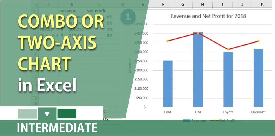
When the numbers in your Excel file vary widely from data series to data series and you want to create a chart, the chart to create is a **Combo** chart. You would also use a combo chart when you have mixed types of data (for example, revenue and net income percentage), you can plot one or more data series on a secondary vertical (value) axis. The scale of the secondary vertical axis shows the values for the associated data series.
A secondary axis works well in a chart that shows a combination of column and line charts.
Chris Menard’s [Youtube channel](
[YouTube Video: https://www.youtube.com/user/chrismenard7)]
with over 240 technology videos covering Excel, Word, Gmail, Outlook, PowerPoint, free apps, and a lot of other technology stuff.
YouTube video on combo or two-axis chart in Excel 2016
Create a combo chart or two-axis chart in Excel 2016 by Chris Menard
Related videos on column charts
Create a dynamic column chart that changes colors for decreases. This is a great chart when using monthly or annual data.
[https://chrismenardtraining.com/post/create-a-dynamic-column-chart-in-excel](https://chrismenardtraining.com/post/create-a-dynamic-column-chart-in-excel)