Sunburst Chart in Microsoft Excel

Create a Sunburst Chart in Excel by Chris Menard - YouTube
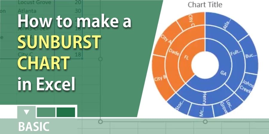
The sunburst chart or multi-level pie chart is ideal for displaying hierarchical data. Each level of the hierarchy is represented by one ring or circle with the innermost circle as the top of the hierarchy. A sunburst chart without any hierarchical data (one level of categories), looks similar to a doughnut chart.
However, a sunburst chart with multiple levels of categories shows how the outer rings relate to the inner rings. The sunburst chart is most effective at showing how one ring is broken into its contributing pieces, while another type of hierarchical chart - the treemap - is ideal for comparing relative sizes.
Steps to Insert a Sunburst chart
1. Select your data. 2. Click Insert > Insert Hierarchy Chart > Sunburst