Create a map chart in Excel from Web Data

You can use Microsoft’s **Map Chart** to compare values and show categories across geographical regions. The map chart works with geographical regions. This means your data should have
1. Countries
2. Regions
3. States
4. Counties
5. Postal codes

Note: This feature is only available if you have an Office 365 subscription. If you are an Office 365 subscriber, make sure you have the latest version of Office.
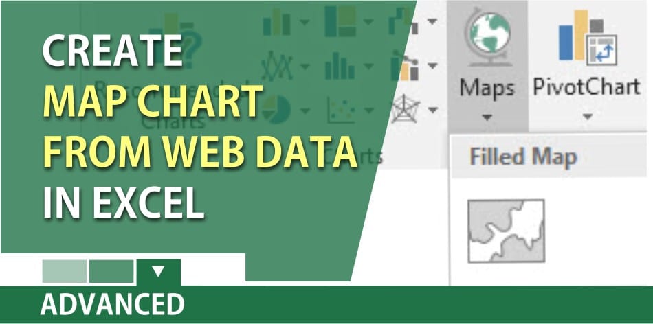
To create a map chart
1. Click a cell in your data range or table.
2. Select the Insert tab > Charts > Maps.
3. Click OK
Video on creating a map chart
Map Charts with Disambiguation, the multiply trick, and two functions by Chris Menard - YouTube