Create a dynamic two color column chart in Excel to show increases and decreases
Posted on: 12/09/2019
Creating a two-color column chart in Excel can be done with an IF statement to make it dynamic. You can manually change the column colors by right-clicking each column you want to change, but that is a lot of work, and if the numbers change, the column could show the wrong color.
Below are two examples that show increases and decreases by month for January through November for one year. Most likely, you will include December, but this request was for only 11 months of data.
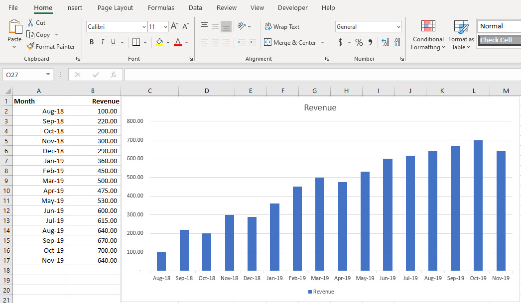
Example 1 - Column chart with one color
This is your default or normal column chart. All the columns are the same color. What I wanted to see is any months that decreased from the previous month to show in a red fill color. October 2018 was $200, but the previous month was $220. October should show in a red fill color.
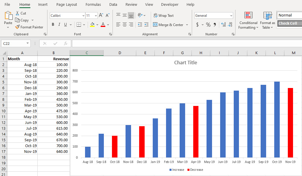
Example 2 - Column chart with a dynamic range using two colors
If a month had a decrease from the previous month, it will show in a red fill color. It is easy to pick out the month where sales or revenue decreased.
Use two IF statements to create the Dynamic Chart.
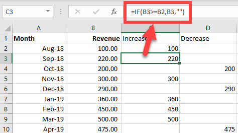
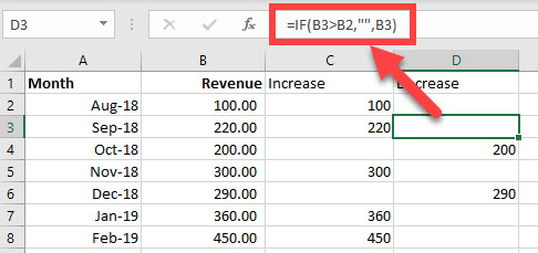
To create the dynamic chart I wrote an IF Statment in cell C3. The IF functon is =IF(B3>=B2,B3,"")
Cell C2 has the number 100 for Aug 2018. It is the base month. The double quotes at the end of the IF statement mean return blank if B3 is not greater than or equal to B2.
Cell D2 is blank because Aug 2018, is the base month (row 2). There is no function in cell D2 (or C2). In cell D3, I wrote another IF Function. The function is =IF(B3>B2,"",B3)
Notice the blank is the 2nd argument. In column C the blank was the 3rd argument. One thing to point out, in C3, I included greater than or equal to =B3>=B2, but in D3, I lost the equal to sign. =B3>B2. I decided if one month was the same as the previous month, show it in blue instead of red. Example: Aug 2018 is 100, and if Sep 2018 were 100, then Sep 2018 would show in blue.
To create the dynamic chart
Here are the steps to create the chart
-
Select A1 to the last cell. In my example, it is cell A17.
-
Hold down CTRL and select C1 to D17. Notice you did not select any number from column B.
-
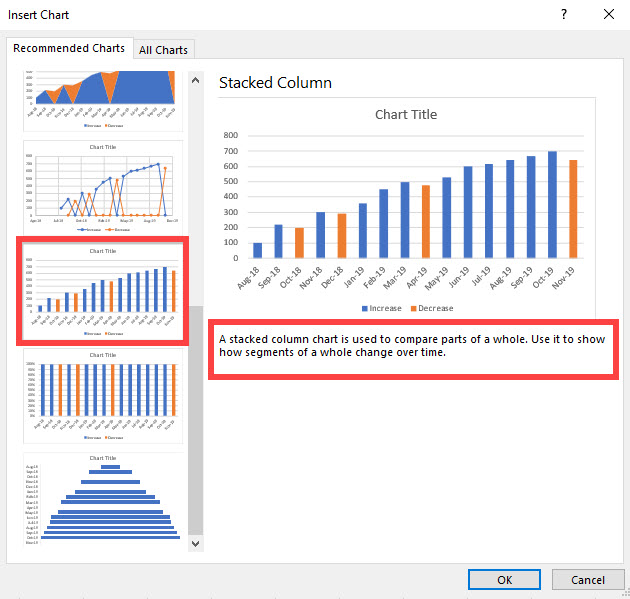
Insert Tab - Recommend Charts in the charts group.
-
I used a Stacked Column Chart.
-
Click OK and resize and position the chart.
YouTube video on creating a dynamic chart
Categories