Create a combo or two-axis chart in Excel 2016 by Chris Menard
Posted on: 03/14/2017
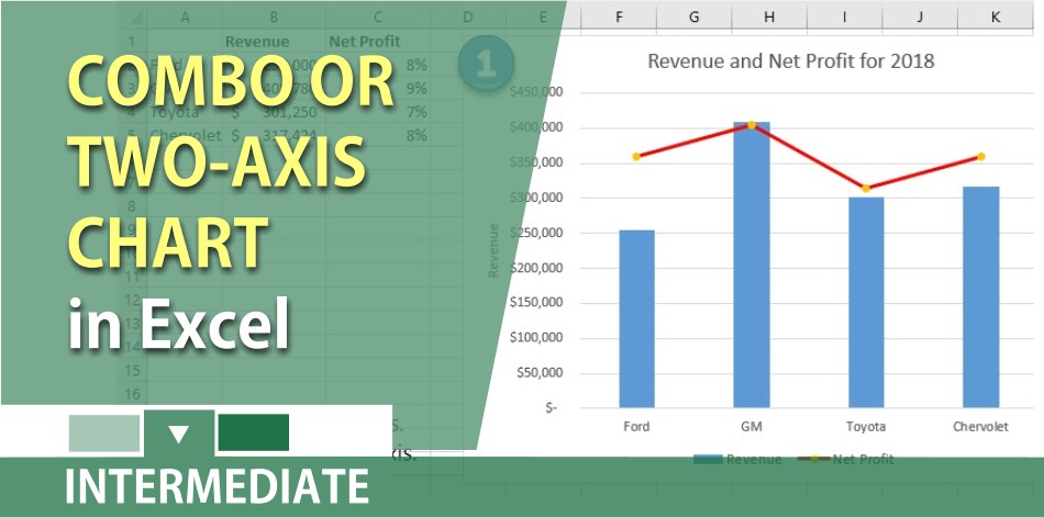
When the numbers in your Excel file vary widely from data series to data series and you want to create a chart, the chart to create is a Combo chart. You would also use a combo chart when you have mixed types of data (for example, revenue and net income percentage), you can plot one or more data series on a secondary vertical (value) axis. The scale of the secondary vertical axis shows the values for the associated data series.
A secondary axis works well in a chart that shows a combination of column and line charts.
Chris Menard’s Youtube channel with over 240 technology videos covering Excel, Word, Gmail, Outlook, PowerPoint, free apps, and a lot of other technology stuff.
YouTube video on combo or two-axis chart in Excel 2016
Related videos on column charts
Create a dynamic column chart that changes colors for decreases. This is a great chart when using monthly or annual data.
https://chrismenardtraining.com/post/create-a-dynamic-column-chart-in-excel

Chris Menard
Chris Menard is a Microsoft Certified Trainer (MCT) and Microsoft Most Valuable Professional (MVP). Chris works as a Senior Trainer at BakerHostetler - one of the largest law firms in the US. Chris runs a YouTube channel featuring over 900 technology videos that cover various apps, including Excel, Word, PowerPoint, Zoom, Teams, Coilot, and Outlook. To date, the channel has had over 25 million views.
Menard also participates in 2 to 3 public speaking events annually, presenting at the Administrative Professional Conference (APC), the EA Ignite Conference, the University of Georgia, and CPA conferences. You can connect with him on LinkedIn at https://chrismenardtraining.com/linkedin or watch his videos on YouTube at https://chrismenardtraining.com/youtube.
Categories